Make the Switch - Job Application Campaign
- May 28, 2020
- 3 min read
Updated: Jun 3, 2020
UX Case Study

Overview
The company I was working with, Full Potential Solutions Pvt. Ltd. was an established contact centre company with branches in the US and Philippines. We, the Indian team, were responsible for the research and development of software products for the company.
The contact centres had their own strategies for agent recruitment and one such was the recruitment campaigns. These were nothing but short term recruitment drives for positions, targeted through social media. It was done with a dedicated website which had a form and some info on the company and the position. They needed a campaign created for the US recruitment team.
The Challenges
The R&D team’s task was to create a campaign with a form for the candidates to apply for their required position and for the recruiters to keep track of applications. The following were our challenges
With the current system, there were server restrictions for the number of applications and we had a problem because of using third-party recruitment sites for application management
Applicants attrition due to unfriendly forms
Accessibility issues of an incomplete form for both the applicants and the recruiters
Problem statement
The recruiters need a way to draw candidates to apply for the campaign and follow up on leads from a secure/in-house system without any server restrictions
Project Plan
The Team:
UX/UI Designer - Ramya Ravishankar
Front end developer - Aswin
Back end developer - Thangaraj
Quality Assurance - Karthikeyan
Design tool used - Figma
Project Strategy
Our plan was to deal with the challenger using “Divide and Conquer” strategy, like the one in programming. Each challenge targeted a different area of the development and we took responsibility for the challenge which was most relevant to each of us.
As a UX designer, my challenge was to design the form in such a way that the applicant attrition could be reduced. I also contributed in thinking of a way to improve accessibility of the incomplete forms.
Serverless architecture, sequential forms and our new mascot - FOX
Challenge #1

Thangaraj came up with the idea of utilising our partnership with AWS and came up with a server less architecture of the system. This led to a breakthrough in the ease of deployments and reduced cost for the company. Since the project was only for a campaign, cost for long term running wasn’t an issue. This came in handy since we needed a lightweight site.
Challenge #2
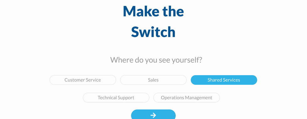
Upon user research done for recruitment scenarios, I understood that our target platform was mobile site and hence our site needed to be responsive. The links were going to be circulated on social media and hence the campaign would best reach the applicants through their mobile phone. Also, the forms being draggy made the applicants feel insecure about sharing their details and even completing their application.
We realised that a conversation would be more effective than a static form and that if a conversation needs to happen, we needed a face for our company. This gave birth to our new mascot, a fox named FPS - Fox P Sierra.


Wireframes designed for the conversational form:


Mobile layout wireframes:


Challenge #3
There are two users for the site-
Applicant - who needs to be able to complete an application and submit it right away or later
Recruiter - who needs to be able to follow up on a lead even if the applicant leaves the application incomplete
The stakeholders suggested that they would like to use emails as their communication medium and that email alerts could be sent to the candidates at each level.
So we design an Email alert system with a similar UI to remind the applicant of their incomplete applications and a link to complete them. Also, a few emails stating the status of their application would be sent.

As for the recruiters we designed an application listing page with capabilities to
View and filter applications
Use the incomplete details to follow up on the leads
Download resumes if uploaded
Manage the status of the application
The form was designed in such a way that, in every step the details that have been filled will be stored in the database and hence no form would actually be a waste even if incompletely filled.


Hurray! It worked!
Our design of a responsive site with a conversational form and a server-less architecture was welcomed by the stakeholders. The email alerts worked well as we tested it with some test applicants and we had finally created a lightweight site with a minimal applicant management system.
Scope for improvement
We did learn that the response time and email alerts could be improved with the first week of the site being live. But with a few tweaks in the applicant management page, we were confident that we could scale this project to a bigger application in the future.


